Infographics
Climate change
Infographics
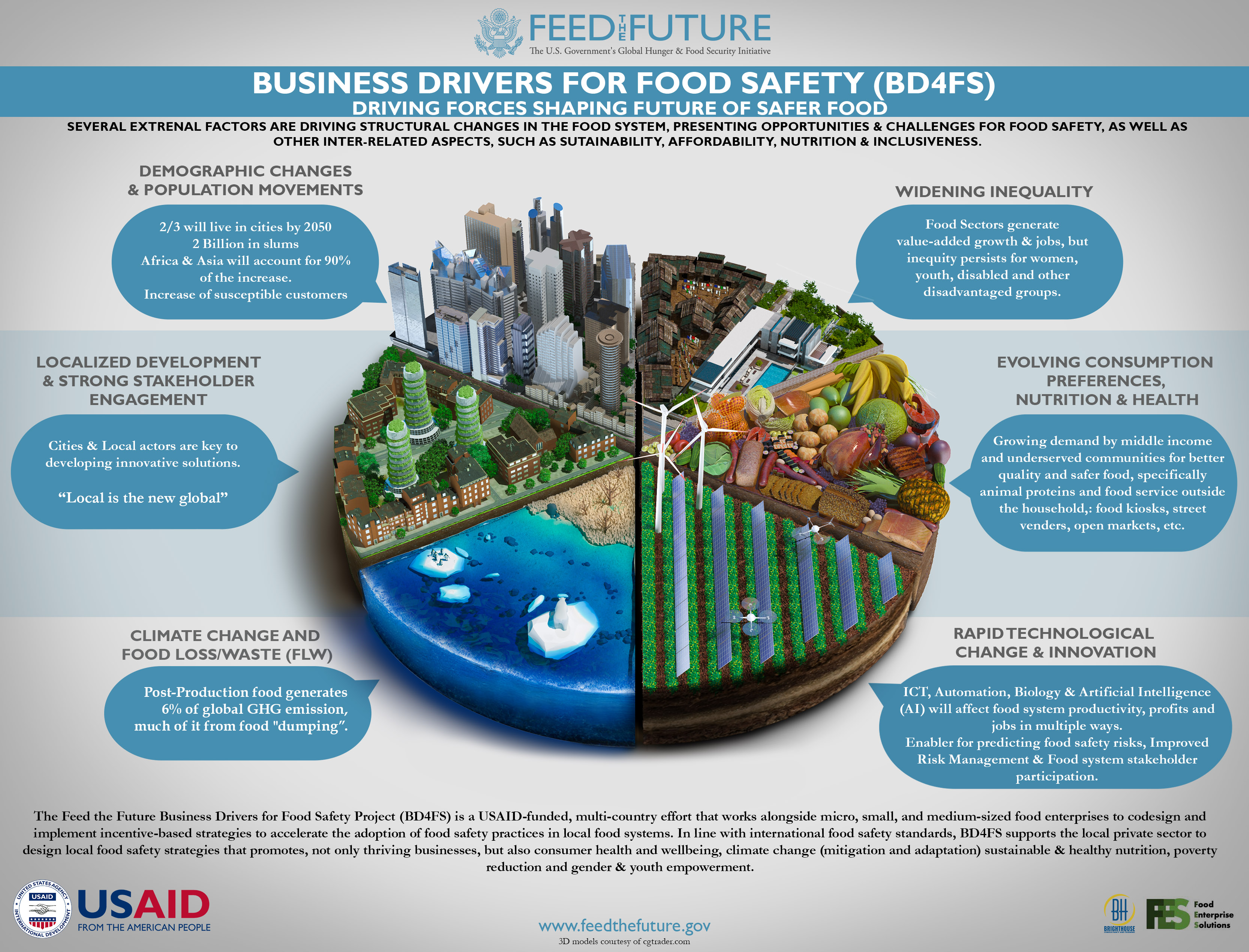
The future of Safer Food
This graphic was created to illustrate the driving forces that will shape the future of food systems in the developing world.
Given the subject matter, I chose to illustrate each aspect as a segment of a pie chart. I used 3d models and photo manipulation in order to produce a high level of detail while retaining visual appeal.
Emmissions Gap
I designed this infographic to visually demonstrate the magnitude of the Emissions Gap in a way that can be understood by non-specialists.
The drawing was made to scale i.e the ratio of the spaces between the 3 main data points is proportional to the disparity in the emissions commitments. This was meant to intuitively convey the fact that global emissions pledges are roughly a third of what they should be in order to keep the temperature increase to the levels agreed upon in the Paris agreement.
I wanted to make the potential implications of our current climate trajectory clear to the reader while at the same time conveying the message that all is not lost and it is still possible to mitigate the problem.
These paralell messages are intended to mutually reinforce each other and the choice of colours was meant to give the graphic a serious yet hopeful tone.

